Let’s Get Cooking! Three Kitchens- Before & After
What a glorious summer it was – in our house we enjoyed lots of outdoor cooking and al fresco dining. But, as summer turns to fall, we’re finding ourselves back in the kitchen, refreshed and ready to dive back into cooking meals indoors. We find this is reflected in the calls we are receiving from homeowners, anxious to remodel kitchens for a variety of reasons – poor traffic and workflow; lack of warmth and character; or simply needing an update. So, the focus of this newsletter is on three kitchens we recently renovated.
Kitchen #1 Craftsman Style:
Part of an expansive high-end, new colonial with many amenities, this home was full of wide, open spaces that lacked character and warmth. The homeowners, a family with three children, wanted to make their kitchen and breakfast area more intimate and functional by adding architectural details, ambiance and storage.
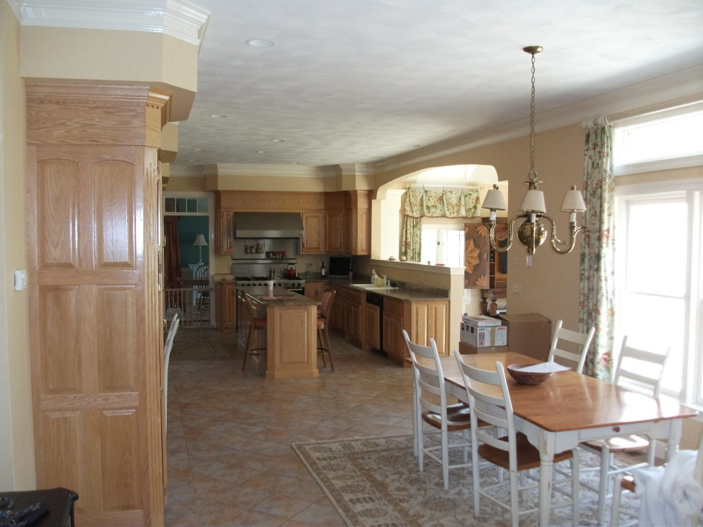
BEFORE
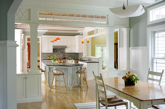
AFTER
The solution was to divide the breakfast area from the kitchen with a columned divider that features decorative architectural panels with transom windows and storage cabinets.
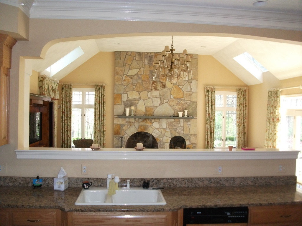
BEFORE
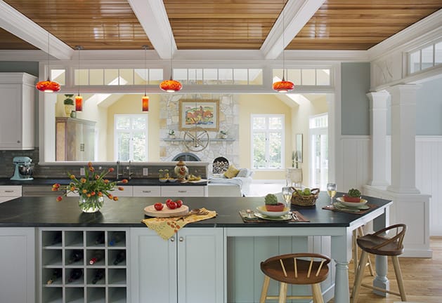
AFTER
In the kitchen a coffered ceiling with natural cedar panels and a marine varnish exude warmth. The kitchen features custom white cabinetry with soapstone countertops, oak flooring, and custom blown glass light fixtures.
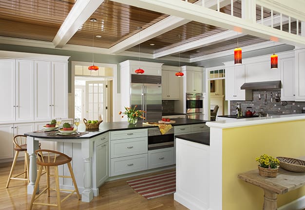
The original block style island was replaced with an enlarged, angled, furniture style island with loads of storage and a comfortable seating area for three. The end result is a more functional and charming space that feels more customized than the original home. (Architectural design by Laine M. Jones Design; photography by Eric Roth)
Kitchen #2 Entertainment Style:
The homeowners of this standard New England Colonial home wanted a more functional, open and contemporary floor plan with the kitchen being the centerpiece of the first floor. The original home featured the traditional front to back formal living/dining room, with the kitchen tucked away at the rear of the house.
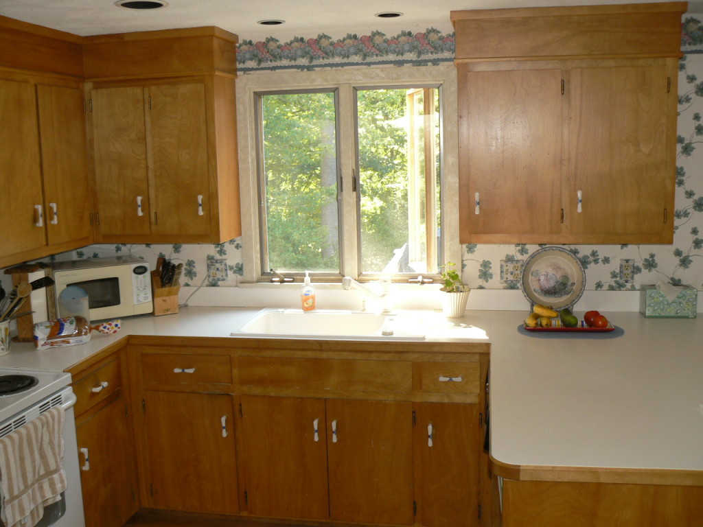
BEFORE
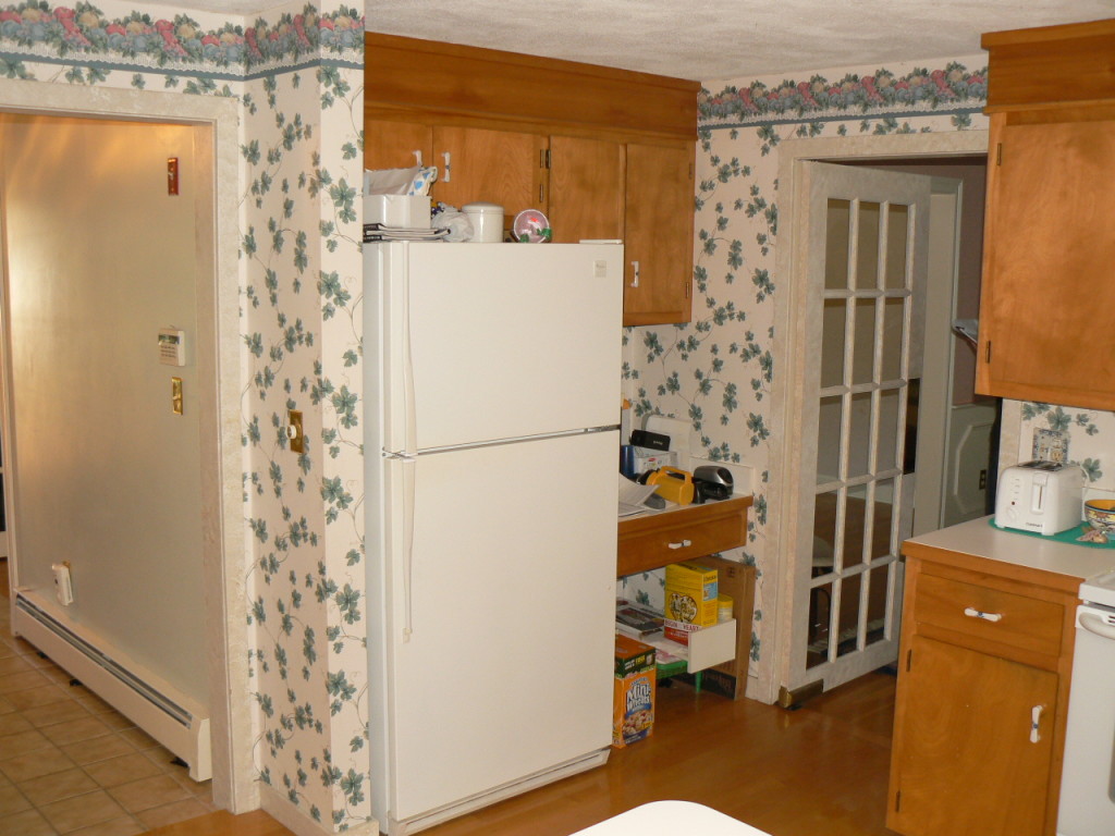
BEFORE
With the new plan, the formal living room has been replaced by a dining room that opens to an enlarged kitchen, designed for entertaining. Walls were removed so the kitchen is open to living spaces on all sides. A painted cabinet serves as a transitional piece between the kitchen and dining room, in place of a wall. It is topped with Red Malibu granite to match the kitchen counters, with display cabinets and storage underneath.
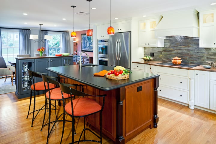
Special features of the kitchen include the furniture style center island with a Cambrian black brushed granite countertop; The color of this granite is repeated in the porcelain tile backsplash which has a slight metallic glaze finish. White custom cabinets blend with the walls to give the sense of a bigger, brighter space.
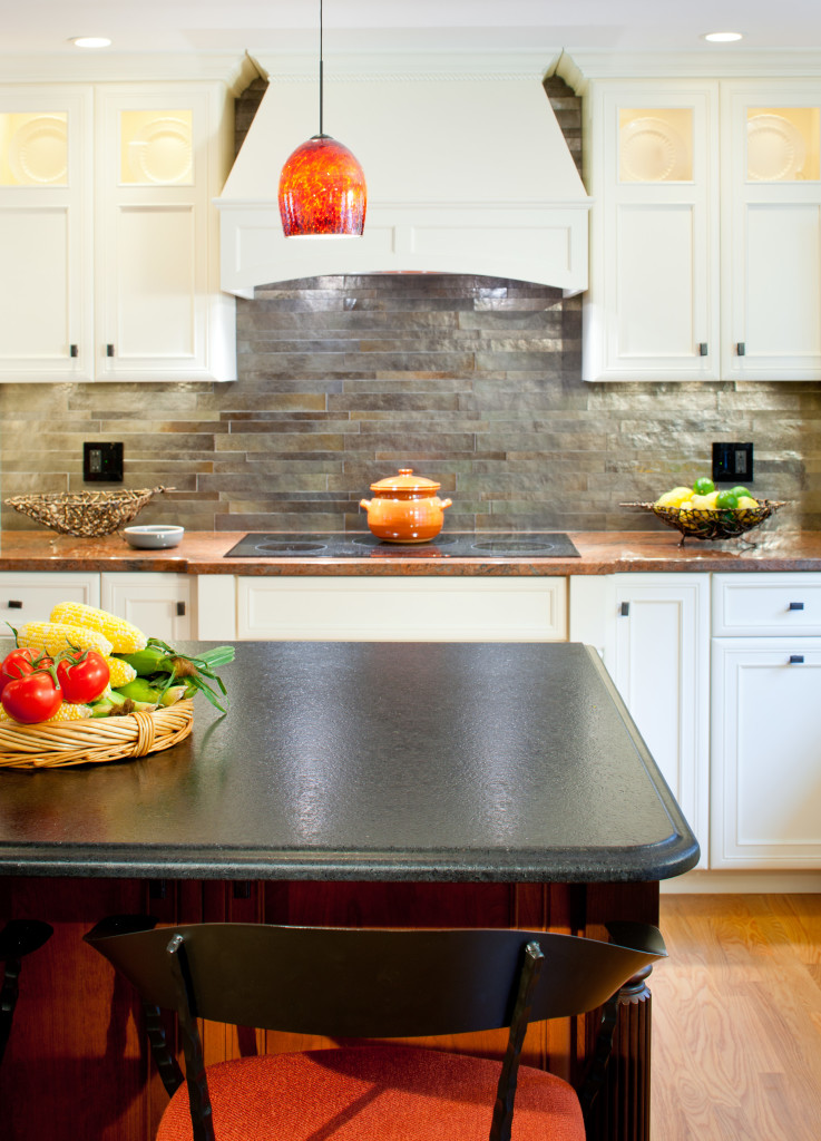
The countertops are made of Red Malibu granite and the pendant light fixture above the island was selected because the color is similar to this granite and to the barstool cushions. The result of the renovation is a light filled, elegant and functional kitchen, perfect for entertaining. (Interior Design by Sue Adams Interiors; Photography by Greg Premru)
Kitchen #3 Historic Renovation:
This kitchen is part of a home built in 1860, located in downtown Andover. In recent times, the home had been modernized, straying from its traditional style. When the new homeowners purchased the house, the kitchen was a utilitarian, dark and cramped space with a powder room at one end.
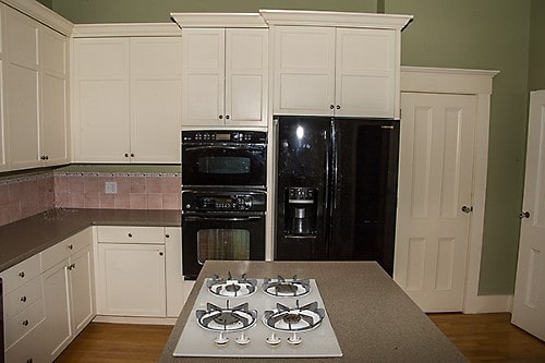
BEFORE
The goal of the remodel was to create a brighter and more elegant kitchen. To achieve this, the powder room was relocated out of the kitchen area to the front hallway, giving it more privacy. This opened space in the kitchen for two additional windows on either side of the cooking area, bringing in light and views of the backyard.
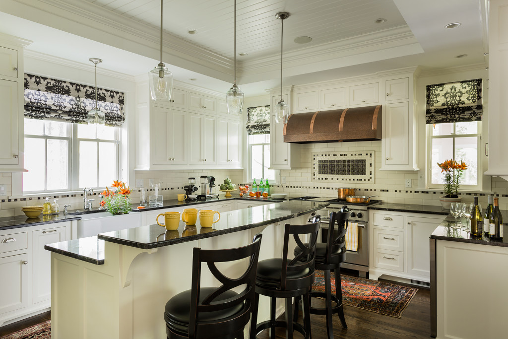
A wood paneled raised ceiling with drop soffit was added, giving new depth and warmth to the room. A glass display cabinet with interior lighting lines one wall adding to the airy, bright ambiance. Elegant styling includes hand painted custom cabinetry with decorative furniture feet and a hand-hammered copper range hood.
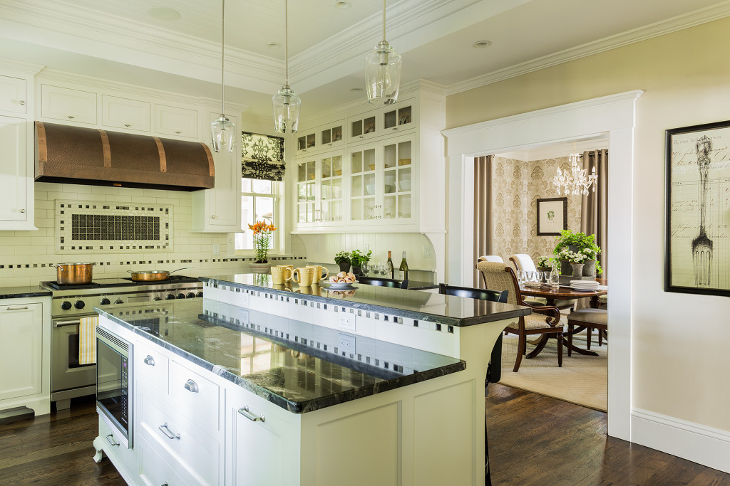
Cosmic black granite replaced the outdated Formica countertops. A custom designed backsplash tile consists of a traditional 3 x 6 subway tile with custom selected square mosaics which tie the dark counters in with the white cabinets. Coppery accents within the mosaics reflect the copper range hood and beautiful wood floors. The flooring throughout the first floor was replaced with antique reclaimed oak. The end result is an elegant, light filled kitchen that reflects the home’s traditional, historic style, while integrating modern amenities. (Interior design by Amanda Greaves & Company, photography by Michael Lee).


